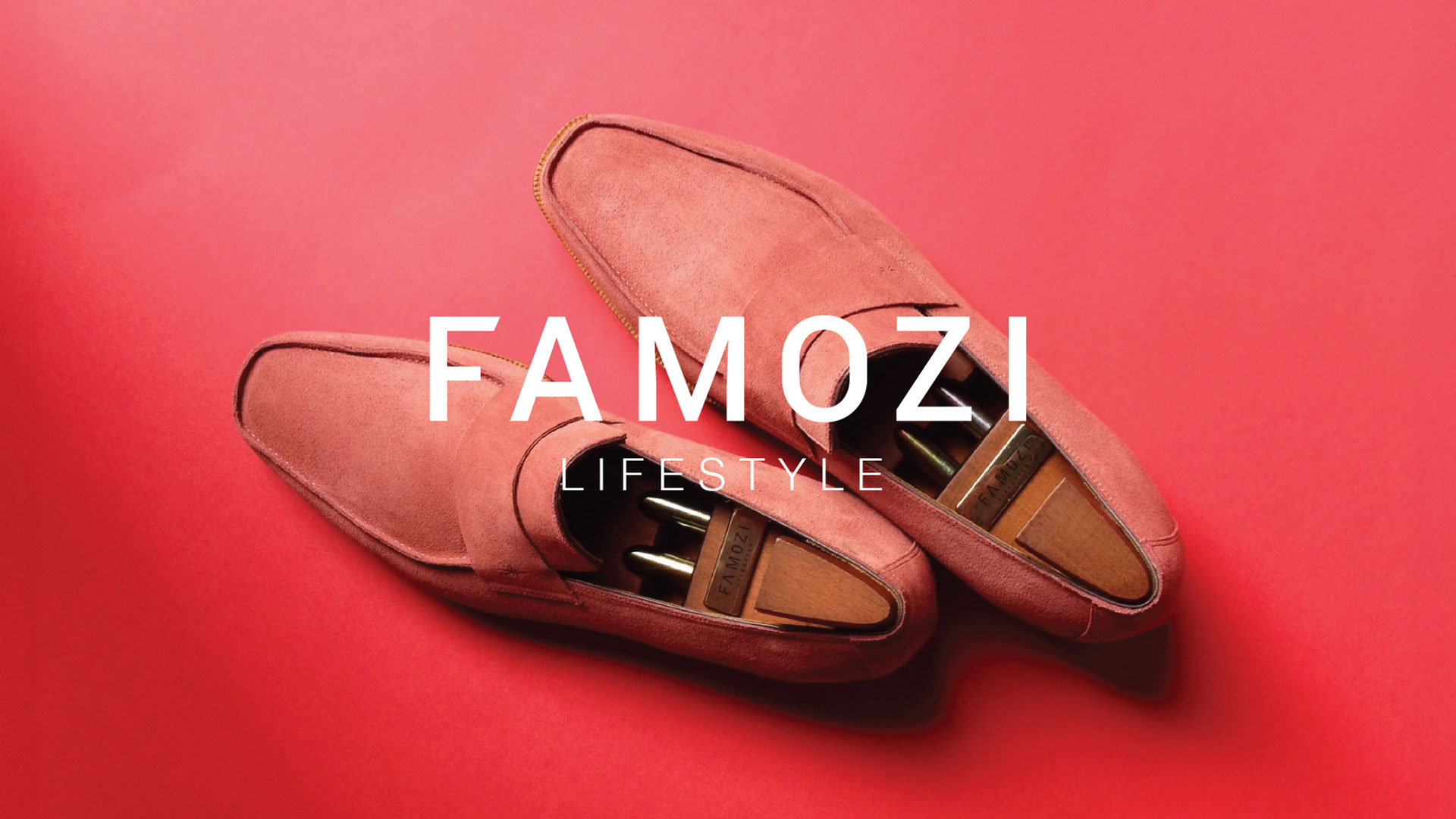
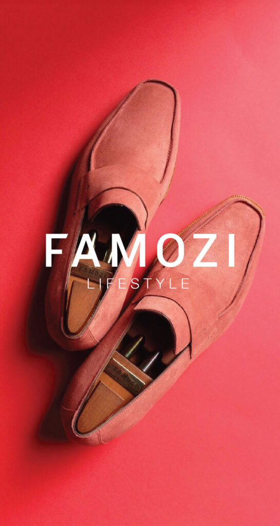
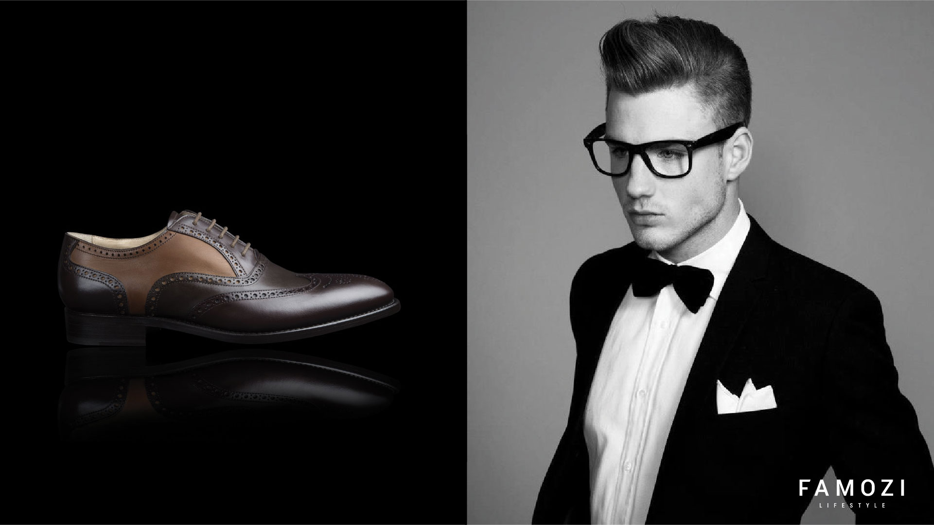
Famozi Lifestyle is a brand of semi formal and formal footwear. They like to think of themselves as a fresh footwear adventure. A kind of lifestyle experience for your legs. A brand of shoes that embraces the style and colors of the seasons. We created one in seasonal colours. So that everyone finds this identity and the brand soaking up the seasonal freshness. And not just with shoes under its legs!
*Famozi was acquired by Future Lifestyle a year and a half after the rebranding.
Scope of work: -Re Branding -Packaging -Art Direction -Retail
Bardot’s brand positioning it’s own territory
Creating a bold identity to convey a strong brand presence that derives from the Latin word Famozi meaning famous. The repositioning of the brand was based on authenticity, beauty, audacity and harmony.
50% GAP
50% GAP
Mood and colour throughout the season.
Famozi makes footwear for all seasons, we have integrated our brand’s color palette into each season. Given that India experiences four seasons, we have chosen four colors that represent each season form the foundation of our brand’s color scheme
50% GAP
Typeface: Lato with a wide varient coverage area.
Lato is a sanserif typeface family designed in the summer of 2010 by Warsaw-based designer Łukasz Dziedzic for the tyPoland foundry. This font, has multiple weights which includes five weights (hairline, light, regular, bold and black).
50% GAP
50% GAP
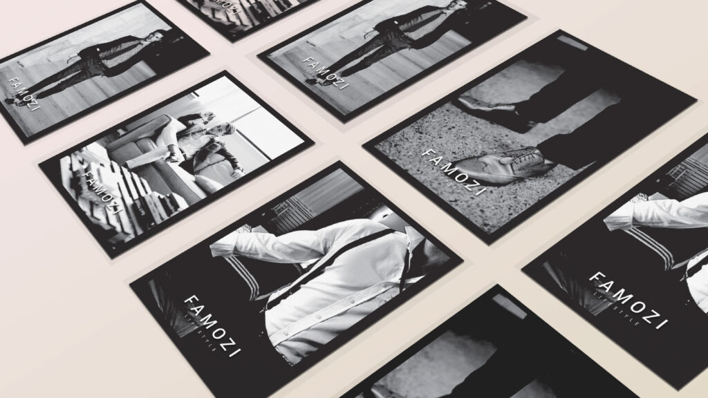
Collateral
Design
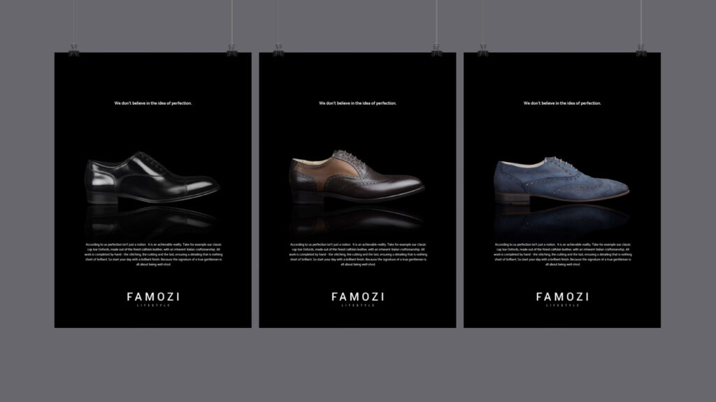
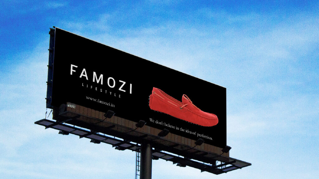
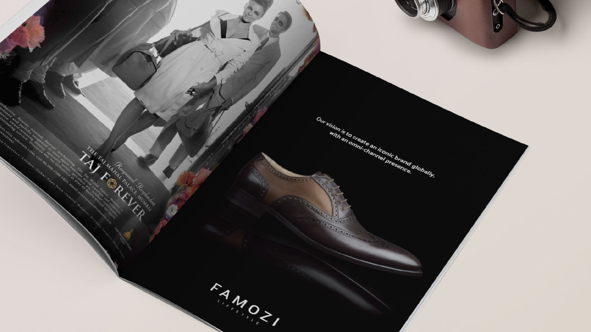
Based on the design and architecture we design marketing materials to print advertising for magazines and various collaterals for Famozi. Keeping in mind we used straight forward content and visuals to focus on the bbrand personality.